Create a top or bottom 100 chart in 3D Maps
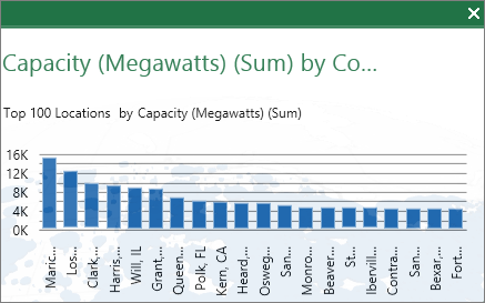
When your 3D Map has a lot of data and it's distributed over many geographic locations, it can be challenging to find the highest or the lowest values. And it's easier to do a visual comparison with a top or bottom 100 chart. Adding a 2 dimensional (2-D) chart makes it easy to see where the highest 100 or lowest 100 values are for all layers inside a scene. On a 3-D chart it can be hard to tell which value is greater due to depth cues, but it's easy when these depth cues are removed on a 2-D chart.

-
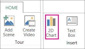
Click Home > 2D Charts.

-
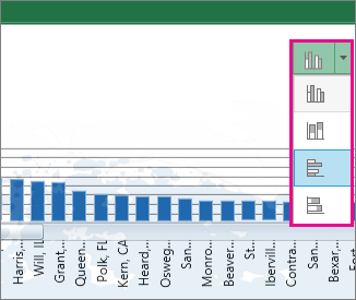
To change to another type of chart, such as a bar chart, click the icon in the upper-right corner of the chart and pick the chart type that you want.

-
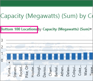
To switch between the top 100 values and the bottom 100 values, click the Top 100 Locations or Bottom 100 Locations link above the chart.

Notes:
-
If there's only one layer in the scene, the chart is generated automatically. If there's more than one layer, pick the layer that you want to show in the chart.
-
You can resize the chart by dragging the sizing handles. This also resizes the column widths.
-
Clicking an individual bar will turn the other bars gray and "brush" the bar on the globe to show where the value is located. The globe or the map will also rotate and zoom so that the brushed location is visible in the center of the map. If the clicked bar isn't visible on the 3-D map, the globe will turn to make it visible.
-
You can change the order if you have more than one value shown in this layer by changing what you're sorting on in the Field List. For example, if you're sorting by count of tickets sold in a zip code, you can change the sort to discount amount per ticket for zip code.
-
No comments:
Post a Comment