BI capabilities in Excel and Office 365
Note: The information in this article applies to Excel 2013 and SharePoint Online in Office 365 Enterprise. If you're looking for information about Excel Services in SharePoint Server 2013 (on premises), see Business intelligence in Excel and Excel Services (SharePoint Server). Business intelligence capabilities are not supported in Office 365 operated by 21Vianet.
Business intelligence (BI) is essentially the set of tools and processes that people use to gather data, turn it into meaningful information, and then make better decisions. In Office 365 Enterprise, you have BI capabilities available in Excel and SharePoint Online. These services enable you to gather data, visualize data, and share information with people in your organization across multiple devices.
What do you want to do?
Use Excel to gather and visualize data
In just a few simple steps, you can create charts and tables in Excel.

Step 1: Get data
In Excel, you have lots of options to get and organize data:
-
You can connect to a variety of data sources in Excel and use it to create charts, tables, and reports.
-
Using Power Query, you can discover and combine data from different sources, and shape the data to suit your needs.
-
You can create a Data Model in Excel that contains one or more tables of data from a variety of data sources. If you bring in two or more tables from different databases, you can create relationships between tables by using Power Pivot.
-
In a table of data, you can use Flash Fill to format columns to display a particular way.
-
And, if you're an advanced user, you can set up calculated items in Excel.
Step 2: Visualize data
Once you have data in Excel, you can easily create reports:
-
You can use Quick Analysis to select data and instantly see different ways to visualize that data.
-
You can create lots of charts that include tables, line charts, bar charts, radar charts, and so on.
-
You can create PivotTables and drill into data by using Quick Explore. You can also use the Field List for a report to determine what information to display.
-
You can create scorecards that use conditional formatting and Key Performance Indicators (KPIs) in Power Pivot to show at a glance whether performance is on or off target for one or more metrics.
-
You can create compelling, interactive visualizations using Power View.
-
You can create interactive maps using Power View, or you can use Power Map to analyze and map data on a three-dimensional (3D) globe.
Step 3: Add filters
You can add filters, such as slicers and timeline controls to worksheets to make it easier to focus on more specific information.
Step 4: Add advanced analytic capabilities
When you're ready, you can add more advanced capabilities to your workbooks. For example, you can create calculated items in Excel. These include:
-
Calculated Measures and Members for PivotChart or PivotTable reports
Use SharePoint Online to share and view workbooks
If your organization is using team sites, you're using SharePoint Online, which gives you lots of options to share workbooks. You can specify Browser View Options that determine how your workbook will be displayed.
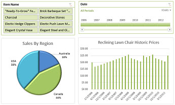
You can display workbooks in gallery view like this, where one item at a time is featured in the center of the screen:

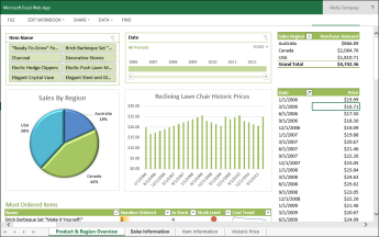
You can display workbooks in worksheet view, like this, where a whole worksheet is displayed in the browser:

When a workbook has been uploaded to a library in SharePoint Online, you and others can easily view and interact with the workbook in a browser window.
Use Power BI for more BI capabilities in the cloud
Power BI gives you even more BI capabilities than what you get in Excel and SharePoint Online. Power BI offers a robust, self-service BI solution in the cloud.
For more information, see Power BI.
No comments:
Post a Comment