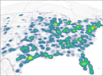
When you open Power Map, Bing Maps automatically plots your data in a column chart. You can change to a heat map, where colors represent your data, making it easy for people to take in lots of data at a quick glance.

-
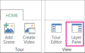
Click Home >Layer Pane.

-
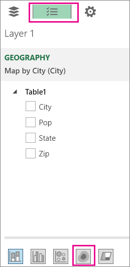
On the Field List tab, click Heat Map.

Notes:
-
When you switch to a heat map, the Height field changes to Value.
-
You may want to zoom in or rotate the chart to get a better view of the heat map.
-
You can't add annotations to heat maps.
-
You need personal informations from companies,family and friends that will better your life and you need easy access without them noticing or you’re financially unstable and you have a bad credit score, come to Brillianthackers800@gmail.com he will solve that without stress,he and his team can clear criminal records without leaving a trace and can also anonymously credit your empty credit cards with funds you need,all these things and more this hacker and his team will do cause they keep you updated on every step taken in order to achieve the goal and they also deliver on time,I tested and confirmed this I’m still happy on how my life is improving after my encounter with them, you can send a mail to Brillianthackers800@gmail.com
ReplyDelete