For best results with Power Map, use data in an Excel table or (preferably) a Data Model you created in Excel or by using Power Pivot. If the data you want to use in Power Map is stored on external servers, you can connect to it from Excel and add it to the Data Model.
Note: Power Map doesn't support hierarchies (groupings of data fields) that you create in the Data Model.
Structure your data
To prepare your data, make sure all of the data is in Excel table format, where each row represents a unique record. Your column headings or row headings should contain text instead of actual data so that Power Map will interpret it correctly when it plots the geographic coordinates. Using meaningful labels also makes value and category fields available to you when you design your tour in the Power Map Tour Editor pane.
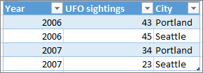
To use a table structure that more accurately represents time and geography inside Power Map, include all of the data in the table rows and use descriptive text labels in the column headings, like this:

Make sure your data isn't structured like this, where some data, like UFO sightings and the years, aren't included in the Excel table:

Include the following data in your table:
-
Geographic values Power Map requires at least one geographic value per row of data. This could be a Latitude/Longitude pair, City, Country/Region, Zip code/Postal code, State/Province, or Address. The accuracy of Power Map depends on the amount and variety of geographic data you provide and the search results from Bing. For example, because there are 18 cities in the US alone called Columbus, it helps to have a State column so the right city can be recognized.
-
Date or time fields Power Map requires at least one date or time field per row of data if you want to view your data over time. For best results, place this temporal data in separate columns, and format it as dates or time (Right-click the selected cells > Format Cells).
Connect to external data
If you'll be working with large sets of data, it'll probably be stored in an external source, such as a database, data feed, or web site. You'll need to import it into your workbook for Power Map to use it.
To connect to external data from Excel (that is, not through PowerPivot), do this:
-
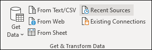
In Excel, click Data > the connection you want in the Get External Data group.

-
Follow the steps in the wizard that starts.
-
On the last step of the wizard, make sure Add this data to the Data Model is checked.
To connect to external data from the PowerPivot window, do this:
-
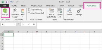
In Excel, click the PowerPivot tab, then click Manage.

-
In the PowerPivot window, click Get External Data.
-
Choose your data type (such as a SQL Server or other database, a file, or a data feed).
-
Follow the steps in the wizard that starts.
The data is automatically added to the Data Model when you get external data through the PowerPivot window.
Tip: If you have Microsoft Power Query for Excel, you can use it to import your data, and then use the Query Editor to shape or transform it. For more information, see Import data from external data sources by using Power Query.
To learn more about connecting to external data, see Connect external data to your workbook and Connect a SQL Server database to your workbook.
Use the source data of a PivotTable
Data in PivotTable format won't work well in Power Map because a PivotTable aggregates totals, such as total sales or total instances of sales for regions. It's best to use the source data of a PivotTable instead, so Power Map can leverage each individual instance as a point in time, animate it over time, and plot it in the exact spot on the globe.
Power Map uses the source data to plot geographic PivotTable aggregations (such as cities across a state, states across a country/region, or countries across a region/continent) on a map that retains the same granular level of detail. The Regions chart type lets you show data across geographic regions of different types, such as by country/region, by state, or by postal code.
Check the quality of your data
When you work with large amounts of data, you might see quality issues, such as typos and inaccurate data. You may want to check the data before you plot it with Power Map—geographic, time, and measures—and then spot check what Power Map has plotted.
In the example shown below, Chicago's population is off by a factor of 10; its data bar is well out of proportion with the data bars for the other very large cities, such as New York and Los Angeles.

Fix your data in the source (such as an Excel worksheet table, or a SQL Server database), and then refresh your data directly from the Power Map ribbon by clicking Home > Refresh Data.

Great Content. It will useful for knowledge seekers. Keep sharing your knowledge through this kind of article.
ReplyDeletePower BI Training in Chennai
React JS Training in Chennai
Power BI Course in Chennai
React JS Course in Chennai
Power BI Training Fees in Chennai
React JS Training Institute in Chennai
React JS Training Center in Chennai