If you have to scroll a lot in your table visualizations to find the data you are looking for, you can use the tile feature in Power View to gain insights from your data much more quickly. Tiles act as navigation strips, with a single tile for each possible field value. When you click a tile, only data related to that field value is displayed. For example, in this workbook of Olympics data, each tile shows data a specific discipline.

In this article
Create a tile container
-
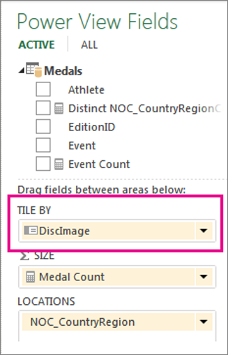
Drag the field you want to use as your tile from the Field List and drop it in the Tile by box.

The tile navigation strip displays the values for that field.
Tip: You can use images in the navigation strip in tiles. Read more about using images in Power View.
-
Click the tabs to move between the data for the different tiles. The data changes in the table according to the tile you select. All content in the container is filtered by the selected tile value.
Note: You can also apply filters from the filters pane to one or more of the visualizations inside the tile container.

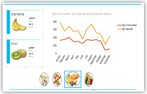
This tile container, filtered by category, uses the category image in the tile flow navigation, and contains a line chart and set of cards filtered for the category selected.
Change the tile navigation strip
The tile container has two navigation strip types: tile flow and tab strip.
-
Click in the tabs area, and on the Design tab > Tile Type > Tile Flow.

Tile flow displays the navigation strip across the bottom of the tile container, with the selected tile always centered. Tab strip displays the navigation strip across the top of the tile container. You can scroll through the tiles by using the scroll bar, or you can click on the tiles.
Add visualizations to the tile container
-
Before adding more visualizations, you may want to drag the edge of the tile container to make it bigger.
-
Click the blank area inside the container and then select fields for the visualization. Remember you create a table and convert into another visualization.
Note: You can create a visualization outside the tile, copy or cut it, and then paste it into the tile container, or cut or copy a visualization from the tile container and paste it in the current view, in a different sheet, or in another tile container. However, if you drag a visualization from outside the tile into the tile, it's not in the tile container. It's just on top of the tile, and its values won't change when you click the different tabs in the tile.
Synchronize axes in a tile container
By default, Power View does not synchronize the horizontal and vertical axes, series, and bubble size in charts in a tile container. For each chart, it sets these scales based on the values in the chart on each individual tile. This makes each chart easy to read. However, it can be hard to compare values across multiple tiles if the scales are not consistent. Synchronizing a chart across the tiles makes it easier to compare the values in the chart from one tile to another.
-
Select a chart in a tile container.
-
On the Layout tab > Axes > click either or both:
Horizontal Axis the Same Across All Tiles
Vertical Axis the Same Across All Tiles
Tip: If values in the chart on one tile are much greater than in another, the chart with the smaller values may be harder to read.
Synchronizing the series means every value is in the legend for every chart, even if a value doesn't exist in a specific chart. For example in a chart of items sold tiled by month, if the series is not synchronized, items in the Items list in the legend will vary, depending on what sold that month. If the series is synchronized, items in the Items list will be fixed, so even if an item didn't sell that month, it will still be in the list.
Tiles in the Power BI app
Tile containers work a little differently in a workbook in the Microsoft Power BI for Windows app. If you're designing a workbook for that, then keep these differences in mind:
-
Tiles use text or images as tabs in the navigation strip.
Note: Tiles with images and text as tabs show only the image on the tab.
-
If you set the Tile Type to Tile Flow, the tabs run along the bottom of the tile container.
-
When you first view the page, all tiles selected.
-
Selecting values in charts in a tile filters and highlights only visualizations in the tile, not on the rest of the page.
See Also
Charts and other visualizations in Power View
Power View: Explore, visualize, and present your data
Power View and Power Pivot videos
Tutorial: PivotTable data analysis using a Data Model in Excel 2013
No comments:
Post a Comment