To make parts of a pie chart stand out without changing the underlying data, you can pull out an individual slice, pull the whole pie apart, or enlarge or stack whole sections by using a pie or bar of pie chart.
To emphasize an individual slice of a pie chart, you can move it back from the rest of the pie chart by doing the following:

-
Click the pie chart.
-
Double-click the slice you want to pull out, and then drag that slice away from the center of the chart.
Pull the whole pie apart

The quickest way to pull all of the slices out of a pie chart is to click the pie chart and then drag away from the center of the chart.
To more precisely control the expansion, follow these steps:
-
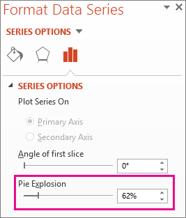
Right-click the pie chart, then click Format Data Series.
-
Drag the Pie Explosion slider to increase the separation, or enter a number in the percentage box.
Tip: You can also give your pie chart a different perspective by Rotating a chart.
Draw attention to small slices in a pie-of-pie or bar-of-pie chart
Pie-of-pie and bar-of-pie charts make it easier to see small slices of a pie chart. These chart types separate the smaller slices from the main pie chart and display them in a secondary pie—or stacked bar chart.
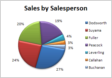
In the example below, a pie-of-pie chart adds a secondary pie to show the three smallest slices. Compare a normal pie chart before:
with a pie-of-pie chart after:
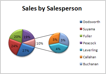
If you don't indicate how many data points should appear in the secondary pie or stack, the chart will automatically include the three smallest. In this example, that is 3%, 3%, and 4%.
Follow these steps to do it yourself:
-
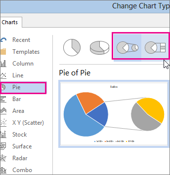
Right-click the chart and then click Change Series Chart Type.
-
Click Pie, and then click Pie of Pie or Bar of Pie.
-
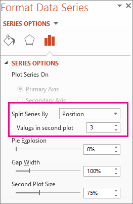
To change what displays in the secondary pie, click the piece of pie you're expanding, and then in the Split Series By box of the Format Data Series pane—click the type of data to display in the secondary chart.
-
To change how many data points appear in the secondary chart, you have two options:
-
If you're splitting the series by position: in the Values in second plot box, enter the number of positions you want (such as 3 if you want the 3 smallest).
-
If you're splitting the series by value or percent value: in the Values less than box, type a different number. In the example above—with 3%, 3%, and 4%—you might enter 5%.
Notes:
-
The left chart is always the main chart, and the secondary chart is always to its right. You can't rearrange them.
-
Connector lines will add automatically. You can remove them or change the connector styles.
-
In Excel, the percentages in the data labels may be rounded. If so, they likely won't add up to 100. To fix this, change the number of decimal places specified for percentages on the Number tab of the Format Cells box (Home tab > Number group, > Dialog Box Launcher
 ).
).
-
-
ReplyDeleteNice Post, Get life time license key of Microsoft Office 2013 Professional Plus from our website at lowest cost. Microsoft Office 2013 Professional Plus takes you one step ahead in expanding business and exclusively designed with the state-of the-art applications right at your fingertips to meet the growing business needs. It delivers you all from professional presentations , managing emails, updating and tracking of calendar, editing and organizing your documents with updated tools. Professionals can create attractive documents with ease from anywhere. You stay connected round the clock through cloud network.
Microsoft Office Tutorials: Explode Or Expand A Pie Chart >>>>> Download Now
ReplyDelete>>>>> Download Full
Microsoft Office Tutorials: Explode Or Expand A Pie Chart >>>>> Download LINK
>>>>> Download Now
Microsoft Office Tutorials: Explode Or Expand A Pie Chart >>>>> Download Full
>>>>> Download LINK z1