Change to a bubble chart in 3D Maps
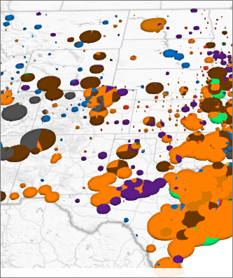
3D Maps shows a column chart by default when you create a map, but you can change that to a bubble chart, where the size of the bubble emphasizes specific data values.

-
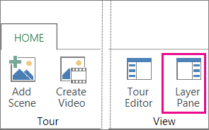
Click Home > Layer Pane.

-
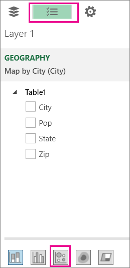
On the Field List tab, click Bubble.

Tip: You can also change the shape of the bubbles.
When different categories are added for the same data points, the bubbles will automatically resize to show the new ratios, in the same way that slices in a pie chart resize when data series are added. The chart legend will also automatically update.
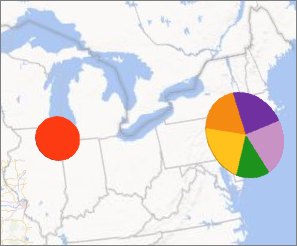
If there are more categories in a bubble chart, it starts to look like a pie chart, showing each of the categories in a section of the whole pie bubble. To create a pie bubble, add one or more category fields to your bubble chart. In the example below, New York City has five tall buildings, while Chicago only has one. So, there is a bubble for Chicago and a pie for New York City. If you wanted to make Chicago a pie bubble, you would add another building.

can the circle shape of the bubble change to hexagon for example?
ReplyDelete