Create a combo chart with a secondary axis
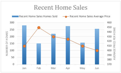
When the numbers in a chart you created vary widely from data series to data series, or when you have mixed types of data (for example, price and volume), you can plot one or more data series on a secondary vertical (value) axis. The scale of the secondary vertical axis shows the values for the associated data series. A secondary axis works well in a chart that shows a combination of column and line charts.

You can quickly show a chart like the one above by changing your chart to a combo chart.
-
Click anywhere in the chart you want to change to a combo chart to show the Chart Tools.

-
Click Design > Change Chart Type.

-
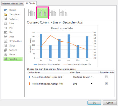
On the All Charts tab, choose Combo, and then pick the Clustered Column - Line on Secondary Axis chart.

-
Under Choose the chart type and axis for your data series, check the Secondary Axis box for each data series you want to plot on the secondary axis, and then change their chart type to Line.
-
Make sure that all other data series are shown as Clustered Column.
To clarify what is plotted on each of the vertical axes, you can add axis titles.
Add axis titles to the vertical axes
-
Click anywhere in the chart, and then click Chart Elements
 .
. -
Check the Axis Titles box, click the arrow next to it, and then check the boxes of the axis titles you want to add.
-
In the chart, click each axis title one at a time, and then type a title that describes the data that is plotted on that axis.
No comments:
Post a Comment